Sunday 21 April 2013

Sony Xperia Z - It Speaks for Itself


Sony Xperia Z


"We have always worked to bring you new experiences and now you can enjoy the best of Sony in a smartphone. Discover the new Xperia Z.


Watching momentous events in history, listening to music wherever you go, recording moments that changed the world, playing games that shaped your childhood, capturing colourful experiences around the globe..."


Music -- Sound and Vision by David Bowie (Remixed by by Sonjay Prabhakar)


Here are some fun location scenes:


Wednesday 17 April 2013

Whiskas revealing the nature of your cute and friendly cat!


After seeing this, you may see your cat differently... The cat food brand Whiskas just launched an amazing campaign in which it depicts your little friendly cat as big cat in the African wild! Created by the british agency Abbott Mead Vickers, the series of print ads shows cats hunting down and provoking very wild animals such as gazelles, giraffes, elephants... 
With this campaign, the brand wanted to show that it gives your beloved cat everything it needs, and that it "feeds your cat's instincts", as it says in the baseline. I think it is really brilliant and will definitely appeals the target: people who love and take care of their cat, and maybe even consider it as a friend. I totally imagine a 25-years-old woman calling her cat "my little hero", telling it how cute it is, and this ad will totally make her buy the product. 

You can also see the TV commercial and its making-of. 

Julie Jamis


Photographer: George Logan
Retoucher: Tony Swinney

Sunday 7 April 2013

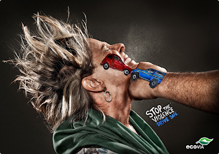
Brazilian prevention about driving safe.


 Today, I found a great print campaign made in Brazil recently. The agency Terremoto Propaganda created several posters for the brazilian transport company Ecovia who wanted to spread awareness about bad behaviors at the wheel. 

Road accidents are very usual, and are often caused by the same mistakes: using his cellphone, speed, drunk-driving, etc. Thus, this campaign warns people about these dangers by stackling every mistake that doesn't have to be done while driving. 

What's more, the idea of the type of visual is really brilliant: it shows at once two vehicles clashing, and the violence it makes on people. The expression on people's face is very meaning and the picture is such in a good quality that we can feel people's pain and fear. 

Last good point on these ads: the catchphrase, that is different on each poster, each talking about a different point, and that is very clear: no metaphor, short sentence, use of imperative.

I think this campaign is a very good one and is efficient in affecting the audience, by shocking, even 'striking' people. 

Julie Jamis


Audi - Chasing Future Markets


This one minute Superbowl advert from Audi this year was not your usual car advert. There were no scenic mountain views or emphasis on sleek dashboards. Instead it tells a short story of an anxious American prom-goer.

A typical young teenage boy is faced with the unhappy prospect of attending the high school prom alone. The boy looks dismal and unenthusiastic as he goes to leave his house. His dad calls him back, tosses him the keys to his 2013 Audi S6 and suddenly we can see his confidence bloom. He drives to the school car park, takes the principles space and struts into the party with pride in toe. Once inside he suddenly steals an impassioned kiss from the prom queen, followed by an inflamed black eye from the prom king. We then see him diving down the highway with a grin on his face, it was worth it.

The overall message is that an Audi will give you confidence, confidence to do anything you want.

I like this advert mostly because I am a car fan who salivates at the sight of a TT or R8 on the road, but also because it is like a mini movie. It throws out a plot and leaves the audience to choose how it plays out. This evokes conversation around the advert and the brand itself. It gives the consumer a sense of control, which evokes confidence - exactly what the ad is depicting.


What I don’t understand is why the luxury automakes spent millions on a placement of an advert which essential only targets a younger hipper market . Okay maybe some American kids get Jeeps as a gift at their ‘Sweet 16’ party but that is only what I have seen on MTV. The Washington Post estimates that the cost for a 30 second slot during the Superbowl costs a hefty $3.5 million. It is known that the typical luxury car buyers are the baby boomer crowd and theresoe I don’t see selling an older man’s car to a younger man as an appropriate objective for Audi.

Maybe they have done their market research and the generation X kids will keep the brand at the top of mind when they can afford the luxury. I suppose the baby boomers won’t be around forever and automakers must prime the pump for new buyers.


Author: Laura Smith

Sunday 31 March 2013

My favorite print adverts #part1

Print adverts are the most common in the World of Advertising and yet one of the oldest way of sending a message to public. Started in the early 17th century the first ever print ad came to live in England and since then, everyone started to use it as a method of communication. 
There is a huge difference between print adverts today and back to 19th - 20th century. People had different standards but they were bursting with creativity. I'm starting my blog as from 'today' up until 'the old times'. 
Today I'm going to post 9 different viral print adverts which are funny, sad and ironic. They are all similar type but also they are very eye catching and colorful.
Enjoy the show :)
Anda Strauberga


Eurostar.com 
"London for lovers"


Deans and Beyond
"Extra strong coffee"


Mebucane
"When swallowing hurts"


Lazer
"Bike helmets"


Scotch
"Magic"


Pringles
"Hot and spicy"


Pepsi
"Pepsi with a twist"


Timotei
"Natural style"


Life buoy dog
"You eat what you touch"


Friday 29 March 2013


Dance Pony Dance


Three - the UK's fastest growing network has came up with another creative viral advert to promote their mobile internet. #DancePonyDance was launched in the mid February 2013 and has became one of the fastest growing ads across the internet. Up to date with its 5,901,943 YouTube views has achieved a majority of good reviews and has been rapidly shared across the social networks.

It's all about this Shetland moon walking pony who is the craziest pony you will ever come across in your life. She is having a time of her life by dancing to a very famous tune  “Everywhere” by Fleetwood Mac and she doesn't want to stop. It's very funny and sweet animated video which put me in a cheerful mood the first time I've ever seen it. I had to rewind it several times because I couldn't get over it, how funny it was.

The advert has a slogan at the very end "Silly stuff. It matters" which is so true. The brand wanted to show that they do care and understand what their users are up to and why not to embrace it. 

Apart from the video, Three also came up with an online app where they had teemed up with YouTube channel for the users to be allowed to create their own Dance Pony remixes. This particular free entertainment was made for people to create and share, and so by that, the word about the tap dancing pony was spreading faster and faster.

As we all heard about the horse meat scandal, I think this particular ad has gained even more respect and adoration from people to horses. Although some people were making jokes around on the social networks like a fan on Twitter @Anthonyshaw, joked: “Love that dancing pony in the new 3 advert,” adding, “It’ll probably be in a lasagne by next week though.”

Oh, no. Please no...


 Ad agency Wieden + Kennedy, London
Creative directors Dan Norris, Ray Shaughnessy
Creatives Freddie Powell, Hollie Walker
Director Dougal Wilson
Production company Blink
Post production MPC
Pony mixer interface and programming by B-Reel. Content created by Blink and Munky.


Anda   Strauberga

Tuesday 19 March 2013

Multicultural Business by HSBC

In recent years HSBC has portrayed a global business image, attempting positioning itself as the 'Worldwide Local Bank'. With their headquarters in London, HSBC has grown to be one of the largest financial services in the world, located in 87 countries.


I was recently introduced to some of their TV advertisements when I met with a Communications lecturer from The Netherlands. She used one of the adverts to illustrate how small local values or habits can be so vastly different in other regions. As I study Marketing, I am becoming increasingly more aware of how in-tune we need to be with many international cultures when entering the world of business.

Taking pride in understanding local cultures, or the 'localisation' of a brand is essential to growing a large international or global organisation. Customers expectations are ever changing, especially as customers travel, and share experiences. Businesses can learn a great deal from the understanding they get from each culture, and should put this local knowledge back into their core ideas. What is learned from one customer should be utilised to help better serve another.


The 'English Clearing Plate' advert considers the different cultural habits in comparison to British culture. I particularly enjoyed this version as it is humourous but also as there is no talking throughout, illustrating how simple gestures alone can mean the complete opposite. 

I learnt quite a few interesting tips from viewing these adverts, some that I hope will save me from some sticky situations in years to come. However, I wonder what might happen when we all become more culturally aware, say a Spanish business man meets a potential business partner from China, for a meeting in Brazil - what values apply? I can definitely see future Marketing students in colleges having a text book titled 'The Safe Option During Foreign Encounters'.

Watch the this video and it might just save you some awkward situations....


Author: Laura Smith


Monday 18 March 2013

Can you rely on your friends?


Have you ever wondered what your best friend would do if you called him for help in the middle of the night?
The Danish brand Carlsberg wants to encourage its customers to live more courageously. Thus, it launched a digital campaign with a video in which people can put their best friends to the test. The story ? A man playing poker at night in a seedy place with people who look everything but reliable, and a friend receiving a call in the middle of the night. The player pretends to need him/her to come immediately with 300€ so that he is released. Then, some of them are told spurious excuses but many are lucky and find out they have great friends, ready to take the risk to come over a scary place crowded with weird people to save their friend. A curtain falls down and an audience applaud the brave friend for taking up the challenge. The hero will recover his/her presence of mind with a deserved Carlsberg.

With this campaign, Carslberg honours friendship. The brand wants its beer convivial, something around which good friends can share a nice time, and it found a very good way to hightlight it. I really loved this ad, firstly because it is very original, the concept is really clever. Secondly, it puts a big suspense, I was really interested in seeing people's reactions and if they would really do it. I was especially surprised and admiring about the girl who came over whereas the place was full of strange and fighting people and she didn't seem to be very afraid! This video is a "short suspense movie", with the difference that it is true and so we can see great and courageous people who are able to do everything for their best friends. It is at time funny but also has an emotional aspect.

What about you, what would you do?

Agency: Guillaume Duval Modem

Julie Jamis

Sunday 10 March 2013

Viral advertising in four colours

Bic hit hard again with its new viral campaign ! After its successful TippEx campaigns in 2010 and 2012, it just launched a campaign aimed at teenagers and students to promote its famous 4 colours pen. Thus, Toy Agency got the brainwave of personifying the 4 colours, so we can meet 4 funny and zany roommates which have their own features: Blue is big-headed because always solicited, Black is neurotic and jealous of Blue because he's only solicited to replace him, Red can't keep himself from correcting everything and Green has become lazy because people don't really need him. The videos highlight all the compulsions we have or used to have when we were in class: who has never spent a lesson constantly clicking his/her pen, or making it turn around his/her finger? The brand showed with humour what happens inside the pen when we're playing with our pen.

With this quirky campaign, Bic found a great way to address 15-25 years old, main users of the emblematic product since two generations! I had a crush on the videos as soon as I watched them, they are, in my opinion, able to captivate attention and very memorable. I think they'll definately permit Bic to increase its success towards the youth.

You can also meet up Blue, Black, Red and Green on their Facebook page.


Julie Jamis


Saturday 9 March 2013

If You Really Want to Touch Someone, Send Them a Letter...


Melbourne based advertising agency M&C Saatchi developed a creative concept for Australian Post in 2007, in an effort to increase the amount of letters sent through their system. Although this idea is almost six years old, I felt it appropriate to review, as tens of thousands of Irish are choosing to emigrate.


These print advertisements caught my eye for two reasons; firstly for the unusual use of typography. When I think of using typography in print advertising it is generally bold headlines, or phrases, certainly not a body made out of a page of text, or a 'body copy' if you will. The second reason it got my attention was because four of my friends are currently living in Australia, some in their second year of emigration and therefore this had an emotional impact on me, as I am sure it would for the other thousands of Irish missing family and friends who have fled the country.

The campaign effectively portrays the message; that there is literally nothing more touching than receiving a letter. However, depending on the cultural dimensions of the country this may not be effective, as many can not openly express a love for touch, but hopefully the Australian's are a 'touchy' race. After reading some critical reviews, it is clear that some audience members found the 'body copy' a little "creepy". Personally I can see where they are coming from, it is a little strange alright, but for me strange is good, strange makes you think.

Overall I like the concept, mainly as I am a fan of creative ideas that are simply clever. I feel it is a good attempt at reaching it's target market, however I think they are trying to revive a time that is well an truly past revival. Personally I love writing, and therefore I like to send and receive letters, but my friends have been away over twenty months now and a Facebook message or a Skype request is all I hold out for. Although I think it is really warming to get a letter from a loved one, I am more than likely one of very few my age who do. Writing a long message on a social media website and clicking send certainly does not create the same emotions as putting pen to paper, licking a stamp and strolling to the post box. Maybe I should start to print out the online messages I receive and put them in an envelope beside my bed, or maybe not?! Either way, in my eyes there remains no written communication more personal that a hand-written letter.


Author: Laura Smith


Image Sources: Google Images